Modular Home Page Template
The Modular Home Page Template is a template available in the CMS (Cascade Server). This template provides a more user-friendly interface to build custom page layouts using the following new features:
- Create custom columns and rows,
- Choose from optional, approved color schemes
- Easily move content around the page
If you have any questions about how to access or use this template, please contact UMCMR Web Marketing team at webmarketing@uh.edu .
Table of Contents
All websites for Colleges, Divisions, Departments, Centers and Institutes that are funded by the University shall follow UH brand guidelines. For more on these guidelines, please review UH Brand Style Guidelines and the Editorial Style Guide.
Basics
The template is/will be available in your pages folder.
The template has the following regions:
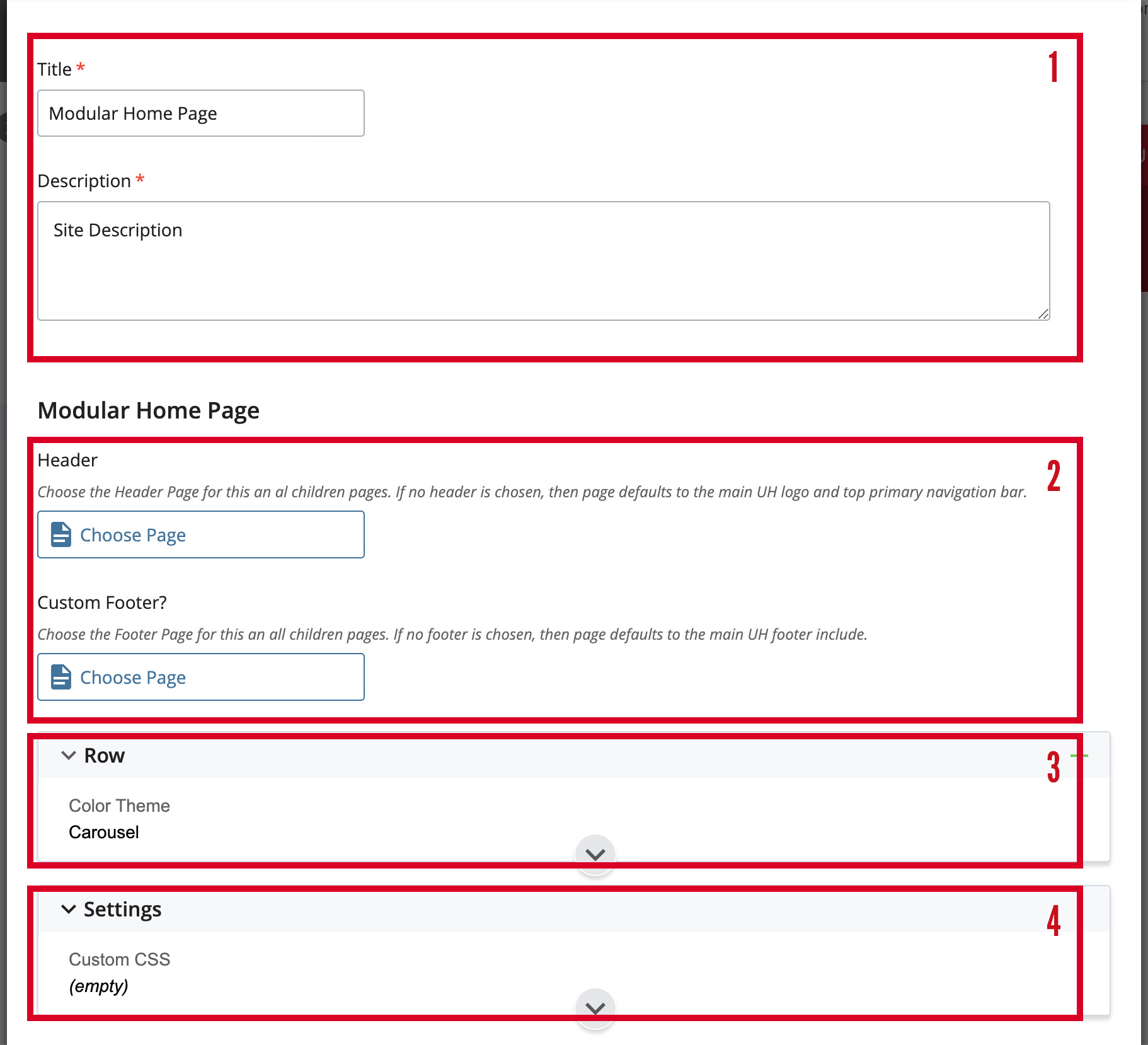
- Inline Metadata (required):
- Title is the page title that will appear at the title tag in search engine results. This title should be concise and 50-60 characters in length.
- Description will appear in search results for this page. Use a keyword rich, compelling description of the page and keep this description around 150-160 characters.
- Header selector: for implementing a custom header with your unit's logotype and optional primary navigation — which will be applied to all pages on your website.
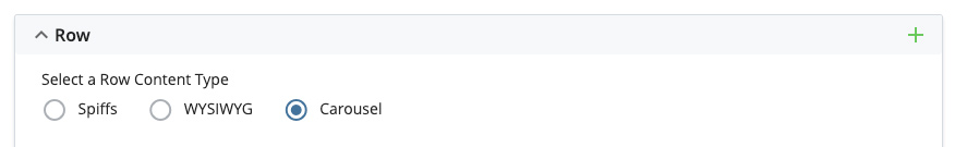
- Row(s): for specifying row display types (expand to see options).
- The row content options are:
- Spiffs (Automatically formatted as SPIFFs)
- WYSIWYG (Allows flexibility of content formatting, text, images, combination)
- Carousel (present format of images, with options)
- The row content options are:
- Settings:
- For adding page-level style sheets (CSS) or scripts (JS).

Add CSS or JS scripts - For adding site-wide customizations (CSS and JS).
- For adding page-level style sheets (CSS) or scripts (JS).
Creating Rows of Content
- Determine how many rows are needed for your page.
- To add a row, click the green plus (+) sign.
Adding Rows
- To add a row, click the green plus (+) sign.
- Select what type of content will be displayed for the row.
- SPIFFs (Special interest features)
- 1-4 columns of content can display per row. Columns are automatically created based on the number selected.
- Content is automatically formatted as SPIFFs.
- SPIFF content follows the pattern of image + heading + paragraph + button. These are pre-formatted callouts commonly used throughout the UH website. They're meant to be short and interesting, with a call-to-action button leading to a web page with additional information on the subject.
- WYSIWYG
- 1-4 columns of content can display per row. Columns are automatically created based on the number selected.
- The WYSIWYG and HTML editors allow more flexibility over the creation of your content and its formatting, but requires more than a basic understanding of editing web page content.
- The content placed in the WYSIWYG editor doesn't have to follow any predefined pattern but its styling must follow UH brand guidelines. Web developers are free to use the HTML editor to input custom markup, use Bootstrap components, and create their own classes for customizing page content.
- Carousel
- There is no limit on the number of items. Columns are based on how many images are uploaded and the size of the browser window.
- Up to 6 items will display at a time.
- Content is automatically formatted using a combination of images and other options.
- The carousel can be used in many different ways. The content could simply be a slideshow of images and captions, or can act as callouts with call-to-action links to other web pages.
- SPIFFs (Special interest features)
- Select the number of columns for the row.
- The columns within a row are flexible in width and will display at different sizes depending on the width of the browser window and the screen size of the device. With that in mind, images will need to be saved for the web at dimensions wider and taller to work well with flexible container sizes.
- General image dimensions:
- An image that spans the width of one or two columns should be at least 570 pixels wide.
- An image that spans the width of three columns should be at least 870 pixels wide.
- An image that spans the width of all four columns should be at least 1170 pixels wide.
- All images should be saved for the web and in most cases should be an optimized JPG file, no larger than 200KB in file size.
Adding Rows of Content
- Expand the row above where you want the new row to appear.
- Click the green plus (
 ) sign.
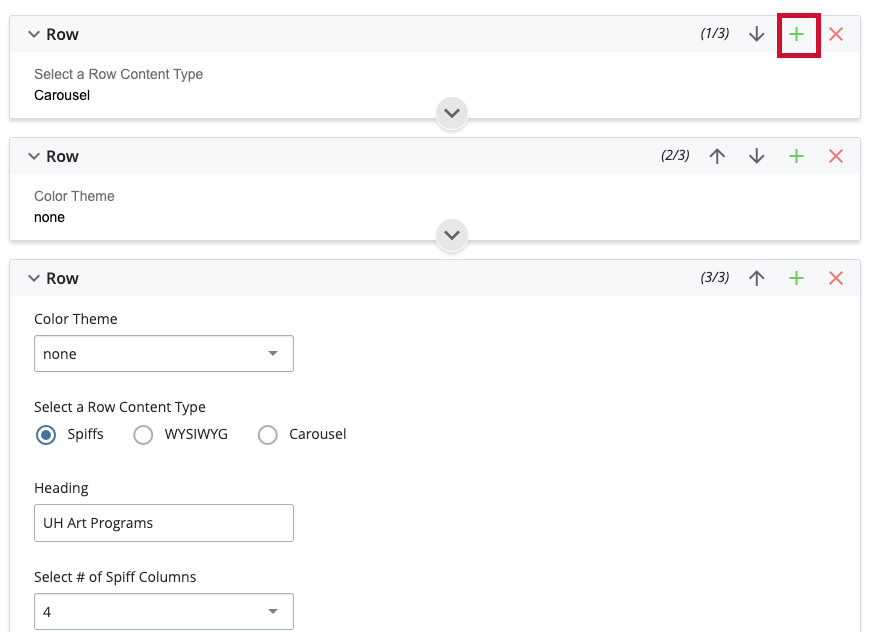
Add new rows by clicking the green plus marker - A new blank row will then be created below the existing row.
- Rows can be re-ordered by clicking the directional arrows.
Deleting Rows of Content
- Expand the row you want to delete.
- Click the red X (
 ) sign.

Delete row by clicking red X marker
Moving Rows of Content
- Expand the row you want to move.
- Select the directional arrows to move the row up (
 ) or down (
 ) the page.
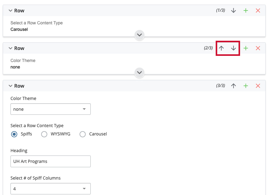
Move rows up or down with the arrows
Row Content Options
Color Theme
Choosing an optional color theme will automatically style the row's background color, text color, hyperlink colors, buttons, etc. The available color themes were carefully built to help rows of page content stand out from others on the page while complying with UH brand guidelines and providing adequate contrast for readable text.
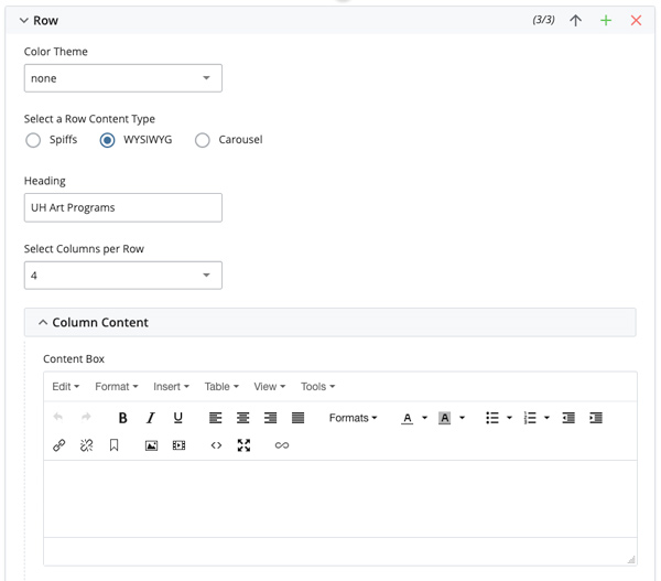
WYSIWYG Content
The WYSIWYG (What You See Is What You Get) editor allows CMS users to add and format page content in a single area with the familiar tools of a word processor. More advanced users can also edit the HTML generated by the WYSIWYG editor or simply write their own.
- Expand the row you want to edit.
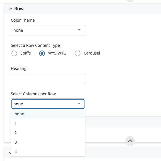
- Select the “WYSIWYG” radio button associated with “Select a Row Content Type.”
- Fill in the “Heading” with text you want to appear as the <H1> header for this row. This field is optional.
- Select the number of columns you want to display in the row from the drop-down menu
(1-4). In the column(s) generated, add content in each WYSIWYG editor area. Content
may be any combination of:
- Text
- Tabular data
- Images
- Embedded content: You Tube, Social Media, Google calendar, etc.
- Use the formatting toolbar to format text, add hyperlinks, photos, etc.
NOTE: WYSIWYG is the only row display type where you can specify that a particular column span more than 1 column. You should only use this option if you have selected 2-3 columns and want to span 1 of the columns across multiple columns, since the total number of columns can not exceed 4.
| Number of columns | Spanned column width equivalent | Other column widths |
|---|---|---|
| 1 | Does not apply | NA |
| 2 | Spans 3 columns | 1 column |
| 3 | Spans 2 columns | 1 column each |
| 4 | Does not apply | NA |
-
- Expand the row you want to span columns
- Select from the drop-down menu the column that want to span across multiple columns.
- Make sure to select a column that actually exists in your row, as the CMS does not provide logic —if your row only has 2 columns, select 1 or 2, if your row has 3 columns, select 1, 2 or 3. If your row has 4 columns, this is the maximum number, you can not select a row to span multiple columns.
Spiff Content
SPIFF content follows the pattern of image + heading + paragraph + button. These are pre-formatted callouts commonly used throughout the UH website. They're meant to be short and interesting, with a call-to-action button leading to a web page with additional information on the subject.
-
- Expand the row you want to edit.
- Select the “Spiffs” radio button associated with “Select a Row Content Type.”
- Fill in the “Heading” with text you want to appear as the <H1> header for this row. This field is optional.
- Select the number of columns you want to display in the row from the drop-down menu (1-4).
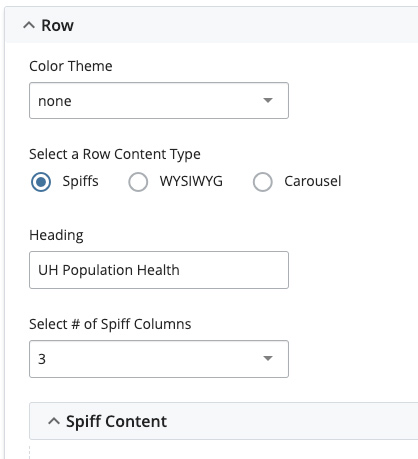
- Expand “Row >> Spiff Content” and in the column(s) generated, add content in each
editor area: An image (optional but suggested)
- Alt text for image (required if an image has been selected)
- Caption text (required)
- Browse and choose an internal page to link the spiff column content or type or paste a URL to an external page, beginning with https://
- Provide custom text for the hyperlink button or leave blank and the default text, Learn More>>' will be used.
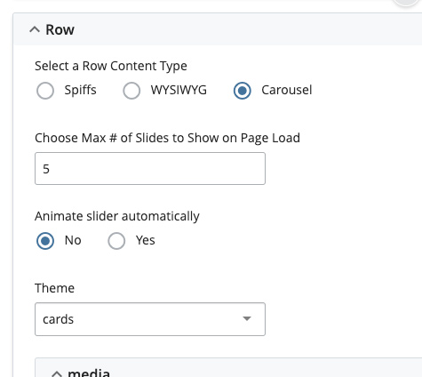
Carousel Content
The carousel can be used in many different ways. The content could simply be a slideshow of images and captions, or can act as callouts with call-to-action links to other web pages.
- Expand the row you want to edit.
- Select the “Carousel” radio button associated with “Select a Row Content Type.”
- Enter the number of slides to show on page load (Min of 3, Max of 6).
- Displaying fewer slides on page means that each image will display larger and likewise if 6 images are displayed on page each image will display smaller.
- Create images all sized 720px wide by 540px tall and the slides will render as needed no matter how many are set to display.
- Select the theme (required).
- 'carousel' - Title displays at the top and Teaser display along the bottom of image.
- 'cards' - Title and Teaser Text display as captions.
- Expand “Row >> media”
- Browse and select an image (previously uploaded to the CMS).
- Enter a 'Title' and 'Teaser Text'. Both are optional.
- Browse and link to an internal CMS page (optional) or type a full path (optional) to an external page beginning with https://
- Click the green plus () sign to create a new slide.
- Continue adding, editing and creating new slides (Minimum of 3 slides required).
- Images may be moved around using the up () or down () arrows.
- Images may be deleted using the red x () sign.