Computational Physiology Laboratory Creates Online Interface
University of Houston computer science professor Ioannis Pavlidis’ Computational Physiology Lab led the creation of a user-friendly, online interface to evaluate aspects of faculty research performance.
The interface, named Scholar Plot, has garnered the attention of faculty around the world as a metric for their work. The theory behind Scholar Plot appeared last month as a paper in the journal Frontiers in Research Metrics and Analytics.
Pavlidis, the Eckhart Pfeiffer Professor at UH’s College of Natural Sciences and Mathematics, said the idea for Scholar Plot grew out of his lab’s study of how cross-disciplinary science can evolve, with the field of genomics as the case study. Through funding from the National Science Foundation and the Kellogg School of Management at Northwestern University, Pavlidis and his lab gathered large amounts of data about computer scientists and biology researchers in the U.S.
With this information, Pavlidis thought they could do something creative and of broader appeal and use.
“That’s how the Scholar Plot started evolving,” he said. “It was an idea about visualizing data about all these researchers from open sources that will allow them to see how they stand with respect to other researchers in similar fields.”
The online interface works by gathering bibliographic and NSF and NIH research funding data on faculty members from online, public sources. Through nominal and normalized metrics, it addresses biases in the collected data. The information is then disseminated online on scholarplot.org.
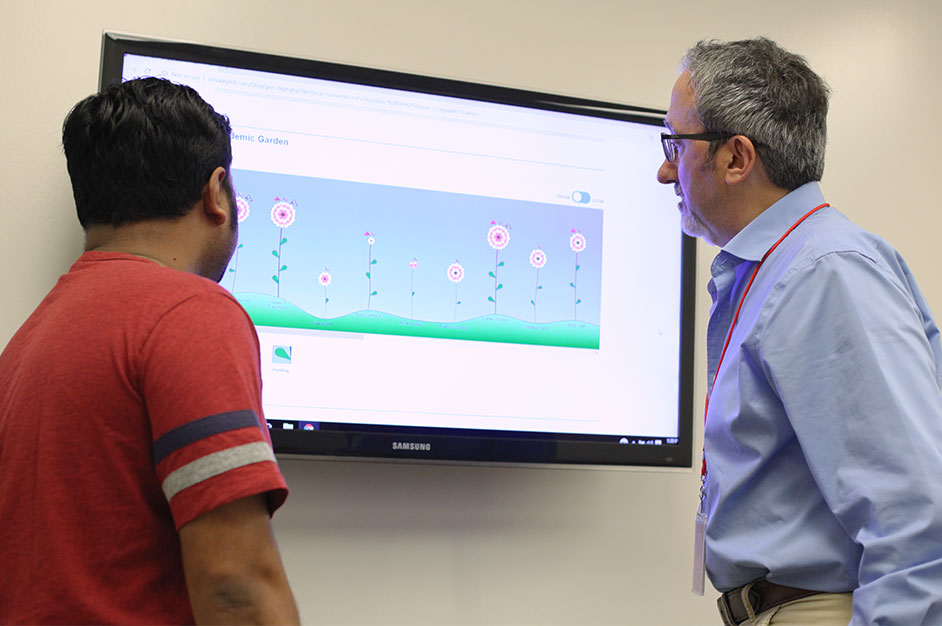
The Faces of Scholar Plot
Scholar Plot presents the academic careers of U.S. faculty members in two ways – through an iconic representation and a temporal plot representation. Interestingly, Scholar Plot scales up to departmental representations because it treats departmental entities as “composite scholars” (see info in chart).
Initially, Pavlidis thought it would be best to create Scholar Plot as a cloud of points. He wanted to contextualize three aspects of academic performance: NSF and NIH funding, citation impact and competitiveness of publication venues.
Eventually, he came up with the idea of a flower to symbolize a faculty member’s career.
“It offered me the opportunity to contextualize people with respect to age,” said Pavlidis. “Flowers, when they bud, are still young. When they’re fully blossomed, they’re older.”
In Scholar Plot, the number of leaves on a flower’s stem corresponds to NSF and NIH funding. There are up to four leaves, with each leaf representing a quartile.
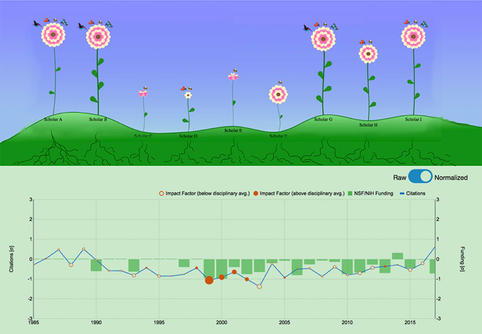
“If you have only one, that means you’re at the bottom 25%,” Pavlidis said.
Pollinators correspond to impact – how many people are using what the researcher has published? Pavlidis said this is measured through citations.
Petals correspond to competitiveness of publication venues – in what journals has the academic published work?
Pavlidis partnered with a visualization expert and colleague at Texas A&M University, professor Ergun Akleman, who implemented the idea with graphics.
In Demand Across the World
A growing number of academics in STEM are using Scholar Plot to see where they stand against other researchers in similar fields. Pavlidis stressed, however, that quantification and visualization of performance metrics in academia is no substitute for thoughtful and holistic peer evaluation. Scholar Plot-type measures have to be used with caution and only for the purpose of enhancing information in conventional sources (e.g., CVs).
“Academia was the initial idea,” he said. “It turns out the methods that we developed can be generalized to visualize performance information across professions.”
Although Scholar Plot could easily translate to different disciplines, the web interface relies on open data. It would be difficult to implement it in private industry.
“It has broad applicability, the caveat is it depends on public data,” Pavlidis said.
“Victims of Our Own Success”
Pavlidis said what started off as a playful idea, has now become “an industrial strength system. We receive daily requests from people outside the United States who want to be in the system.”
Only he and his lab are maintaining it.
“We started it as an outreach effort,” Pavlidis said. “We did not expect it to be so successful. But now, it has been, and we’re the victims of our own success. Moving forward, we need to figure out how we will handle the significant load.”
In the Frontiers publication, Pavlidis was joined by Dinesh Majeti (Ph.D. ’18) and Ph.D. student Mohammed Emtiaz Ahmed of UH’s Computational Physiology Lab, Ergun Akleman of Texas A&M University, Alexander Petersen of the University of California, Merced, and Brian Uzzi of Northwestern University.
- Rebeca Trejo, College of Natural Sciences and Mathematics