University of Houston Brand Style Guide
The University of Houston brand consists of much more than logos and trademarks. The colors, typography, graphics, design, photography, video and editorial style that make up the UH brand are concrete expressions that convey the University’s brand pillars and personality traits in all of our communications and marketing materials.
By having a strong, unified brand we shape our audience perception and cultivate a personal connection through the stories we tell. You can obtain brand-approved assets for the elements described below in the Download Zone.
Table of Contents
Colors
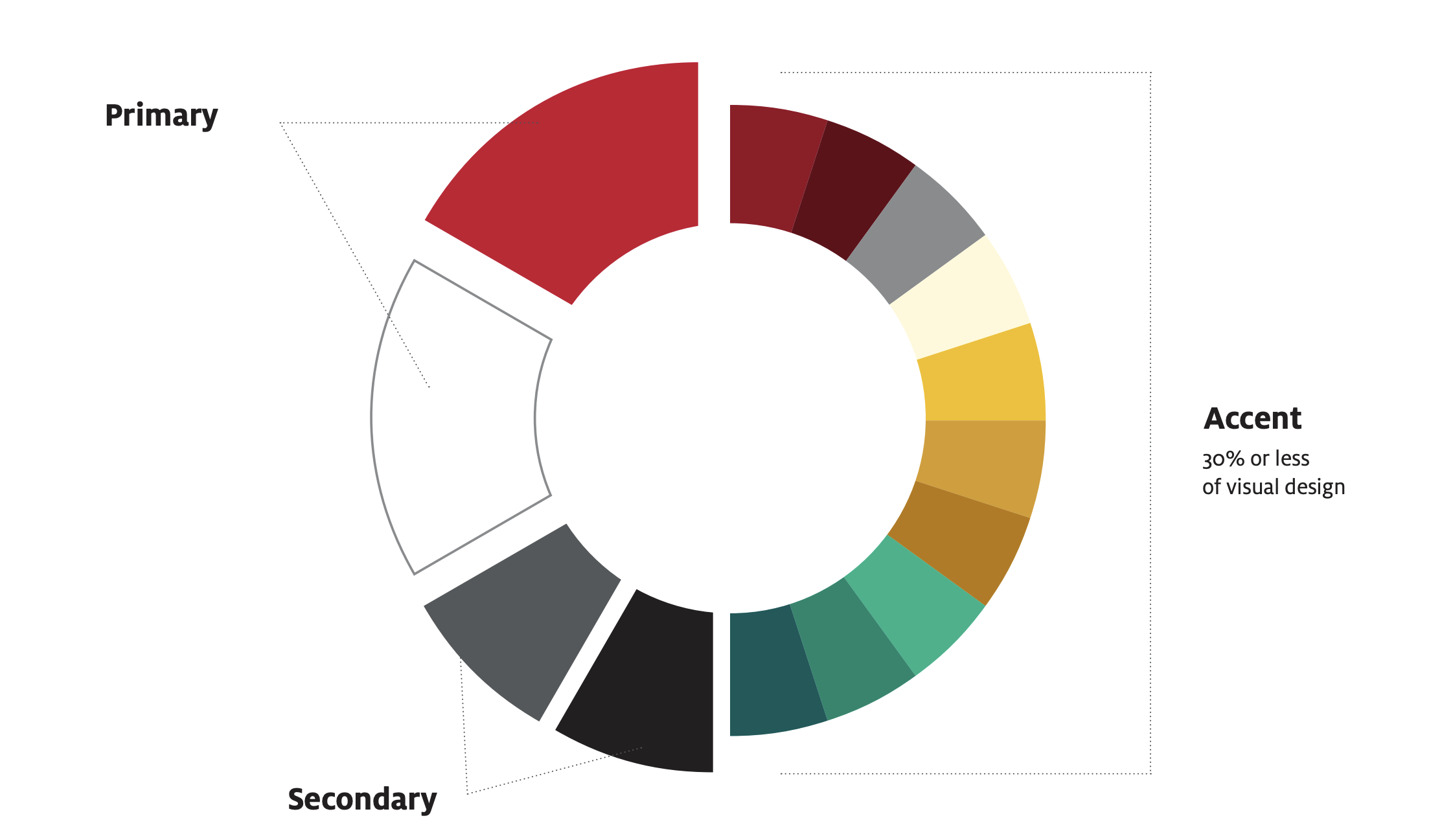
The selection of our primary color palette showcases our bold nature. Our secondary and tertiary colors incorporate a range of warm, deep complementary hues while providing a creative yet prominent palette. Red (PMS 186) is the University of Houston’s main color (Go Coogs!) and should be present in designs whenever possible.
Primary Colors
Our brand is built on the bold red and white of the University of Houston. Red symbolizes our pride, energy and determination and should be prominent in all designs. White brings balance and clarity, enabling our message to stand out. Black and Slate may be used as secondary brand colors.
Accent Colors
A palette of complementary accent colors is available to add visual interest to designs. They should be used sparingly and with purpose to add variety to layouts, organize information or reflect a theme or season – always supporting and never overpowering our red and white, Accent colors should not account for more than 30% of visual designs.
Primary Colors
RGB: 200-16-46
CMYK: 0-100-81-4
PMS 186 C
Hex: #C8102E
RGB: 255-255-255
CMYK: 0-0-0-0
PMS White
Hex: #FFFFFF
Secondary Colors
PMS Black
Hex: #000000
RGB: 84-88-90
CMYK: 45-29-26-76
PMS 425 C
Hex: #54585A
Accent Colors
RGB: 150-12-34
CMYK: 8-97-76-31
PMS 704 C
Hex: #960C22
RGB: 100-8-23
CMYK: 26-85-85-72
PMS 490 C
Hex: #640817
RGB: 255-249-217
CMYK: 1-2-24-0
PMS 7499 C
Hex: #FFF9D9
RGB: 136-139-141
CMYK: 26-16-13-46
PMS Cool Gray 8 C
Hex: #888B8D
RGB: 246-190-0
CMYK: 0-29-100-0
PMS 7408 C
Hex: #F6BE00
RGB: 216-155-0
CMYK: 10-30-100-0
PMS 124 C
Hex: #D89B00
RGB: 185-120-0
CMYK: 9-35-98-30
PMS 1245 C
Hex: #B97800
RGB: 0-179-136
CMYK: 84-0-59-0
PMS 339 C
Hex: #00B388
RGB: 0-134-108
CMYK: 100-10-61-38
PMS 328 C
Hex: #00866C
RGB: 0-89-80
CMYK: 95-25-70-68
PMS 3305 C
Hex: #005950
For most print and merchandise use the PMS or CMYK color models whereas RGB and HEX are best for digital applications.
Important Notes on Contrast
The colors Black, Slate, Brick, Chocolate, and Forest are dark enough to display behind white text and meet minimum AA accessibility contrast requirements.
Colors with an asterisk (*) can pass with either white or black text. When pairing any other color of text, always check that the contrast ratio meets minimum accessibility requirements.
All other colors only meet minimum AA accessibility contrast requirements when placed behind black text.
Typography
The University of Houston’s fonts are a visual extension of the brand. League Gothic, Source Sans 3 and Crimson are the three mainstays that provide a strong, refined, yet academic style representative of the University and strengthen the brand with consistent use. Use all three typefaces to create emphasis and information and messaging within your communications.
Headline
League Gothic is the headline font in the University of Houston’s brand and should be used for big typographic moments.
Secondary
Source Sans 3 is the typeface suitable for headers, subheads, pull quotes, title pages and body copy or instances where legibility must be immediate, such as billboards.
Source Sans 3 is an open-source font available from the Google Fonts website at this link:
For UH Brand purposes, the recommended Source Sans 3 weights are marked with a double asterisk (**), while other frequently used styles are marked with a single asterisk (*).

Body
Crimson is the primary supporting typeface for the UH brand. It is suitable for use in body copy and subheads.
- Crimson Regular
- Crimson Italic
- Crimson Semibold
- Crimson Semibold Italic
- Crimson Bold
- Crimson Bold Italic
Limited Use
Alex Brush is a limited-use display font in the University’s brand. It is an option to be used sparingly on materials created for formal events. Some usage examples for this font include black tie events, VIP greetings and holiday cards. This font should not be used with a shadow behind it or in all caps. It should not be used for significant blocks of text. We encourage the primary use of Source Sans 3, League Gothic and Crimson on materials.
Having Trouble With Fonts?
If you’re having trouble incorporating the university fonts in your communications, Brand Management, Licensing & Trademarks can help. Email us at branding@central.uh.edu, and we’ll work with you to find compliant solutions.
Graphics & Design
Graphics are a key part of our identity. Our graphics utilize current elements of the brand and introduce new and interesting methods to create effective communications. This style accommodates a wide range of skills, allowing for simple layouts to more complex layered designs. Below are examples of the various elements that make up our graphic style.
Brand Typography
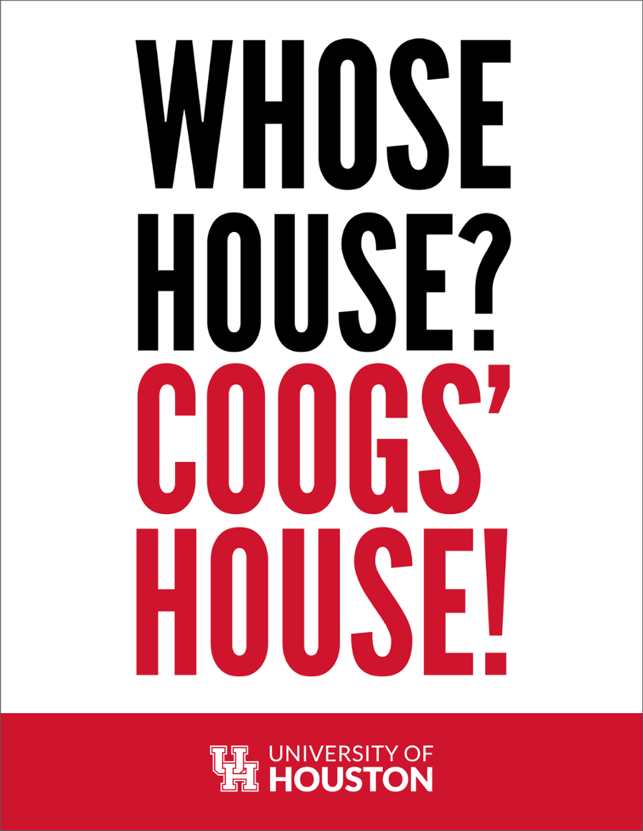
Brand typography should be used as a graphic element. With three different fonts available, they can be used with brand colors to create interesting text treatments. The placement and creative uses of the font should convey as much meaning as the words.

Layered Graphics, Text and Images
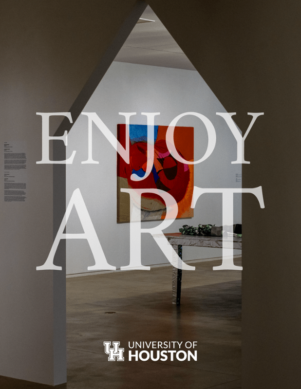
Continue to use strong photos that align with UH brand photography but make sure that the photo has a layout or composition that allows for layering of graphics and text.

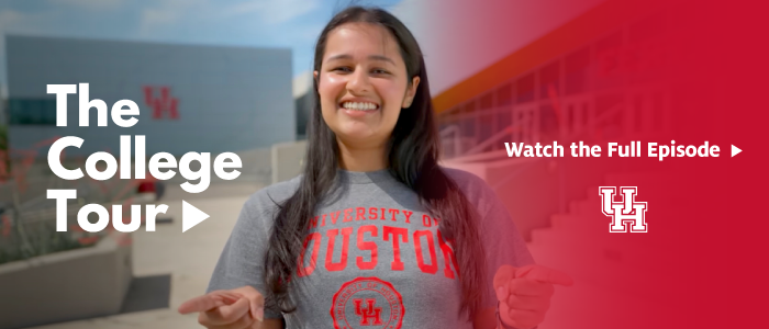
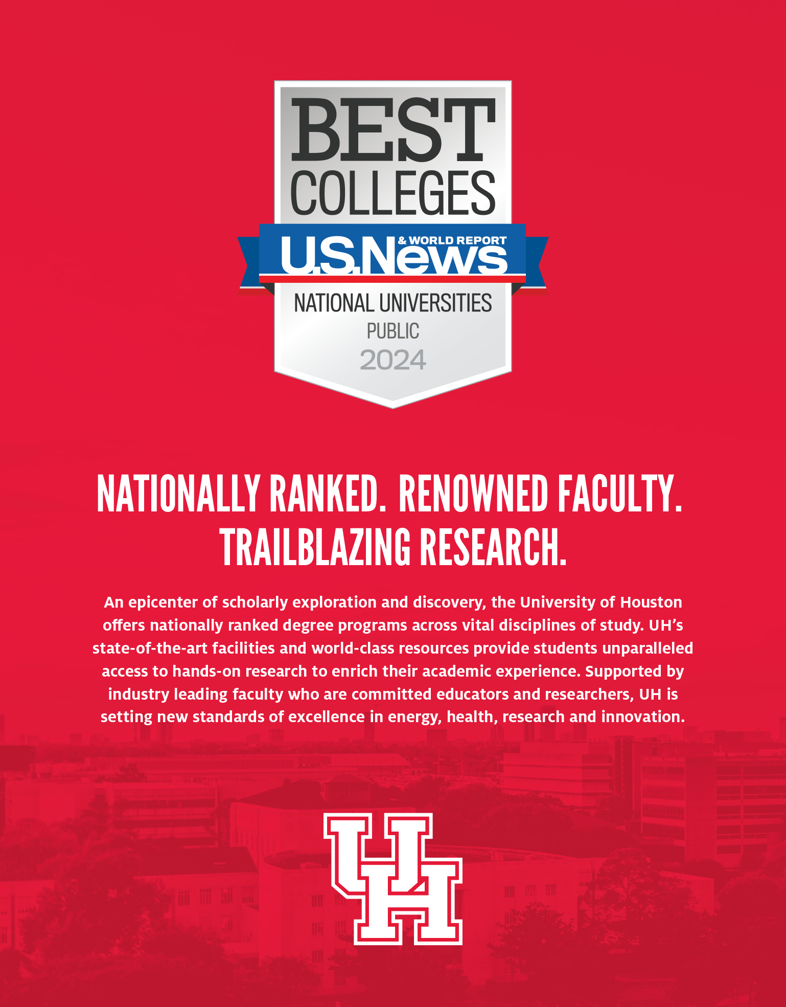
Gradients and Transparency
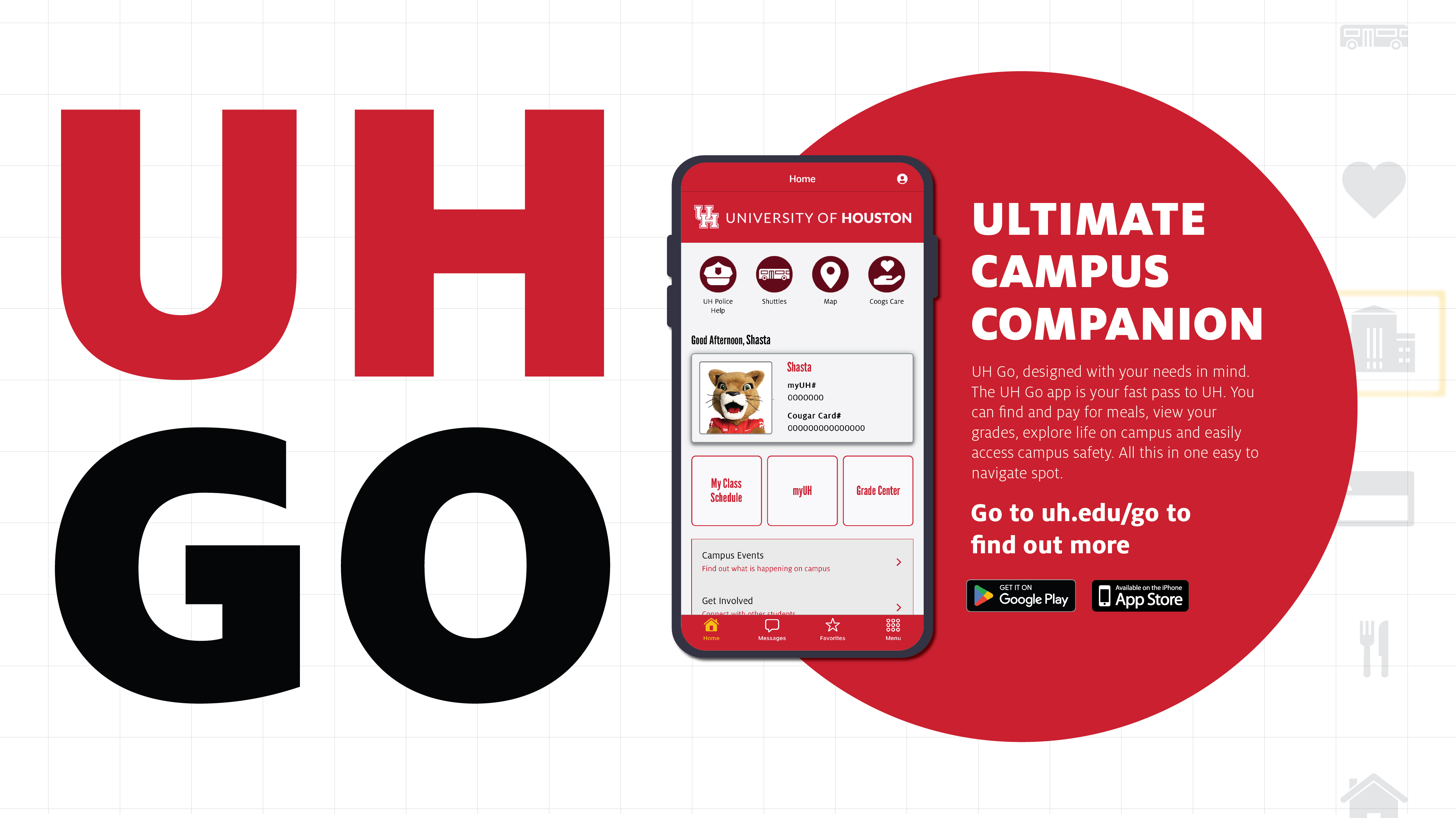
Use gradients and transparencies of color to engage with text and images.

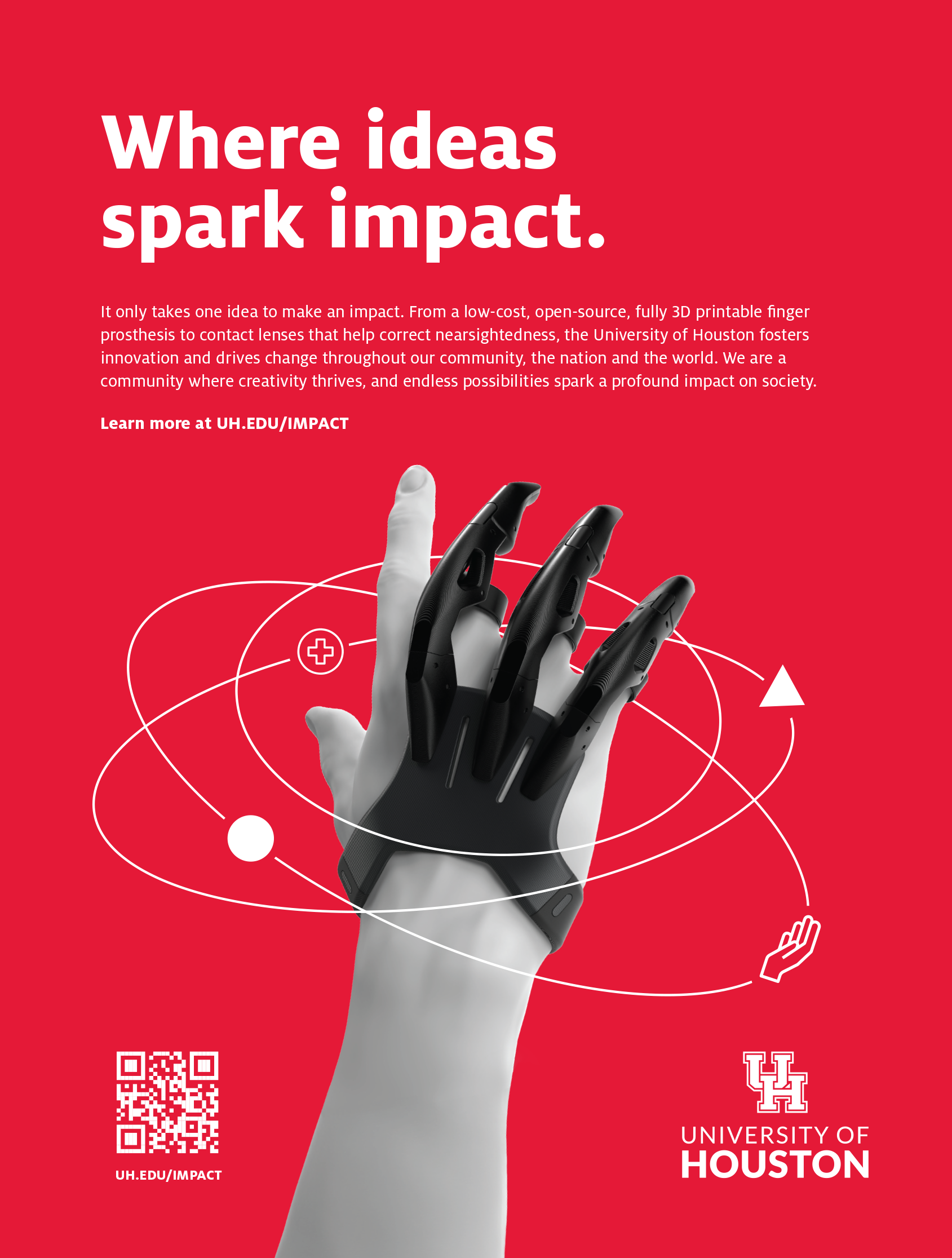
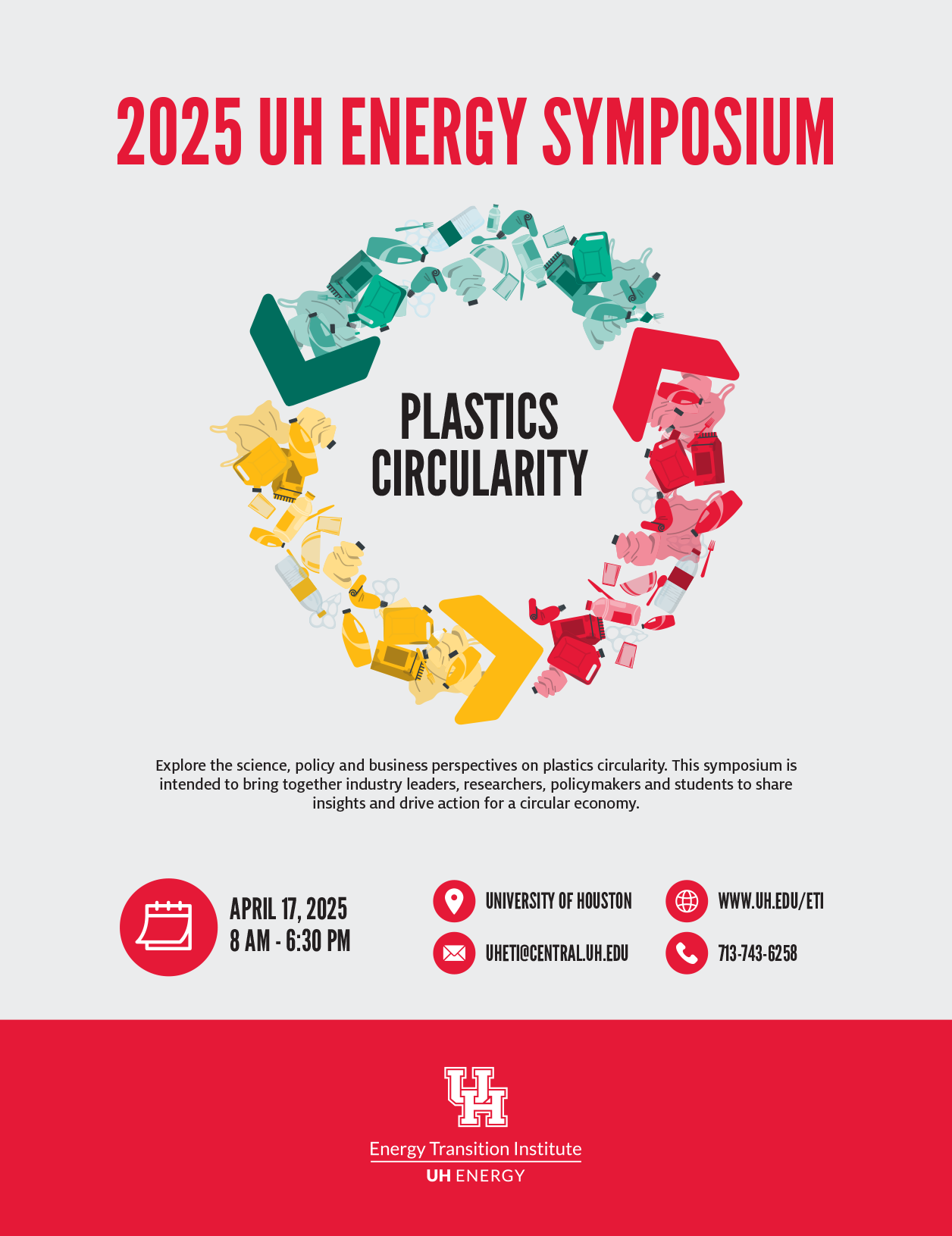
Shapes, Lines and Color Blocking
Use geometric shapes, lines, and blocks of color to engage with text and images.
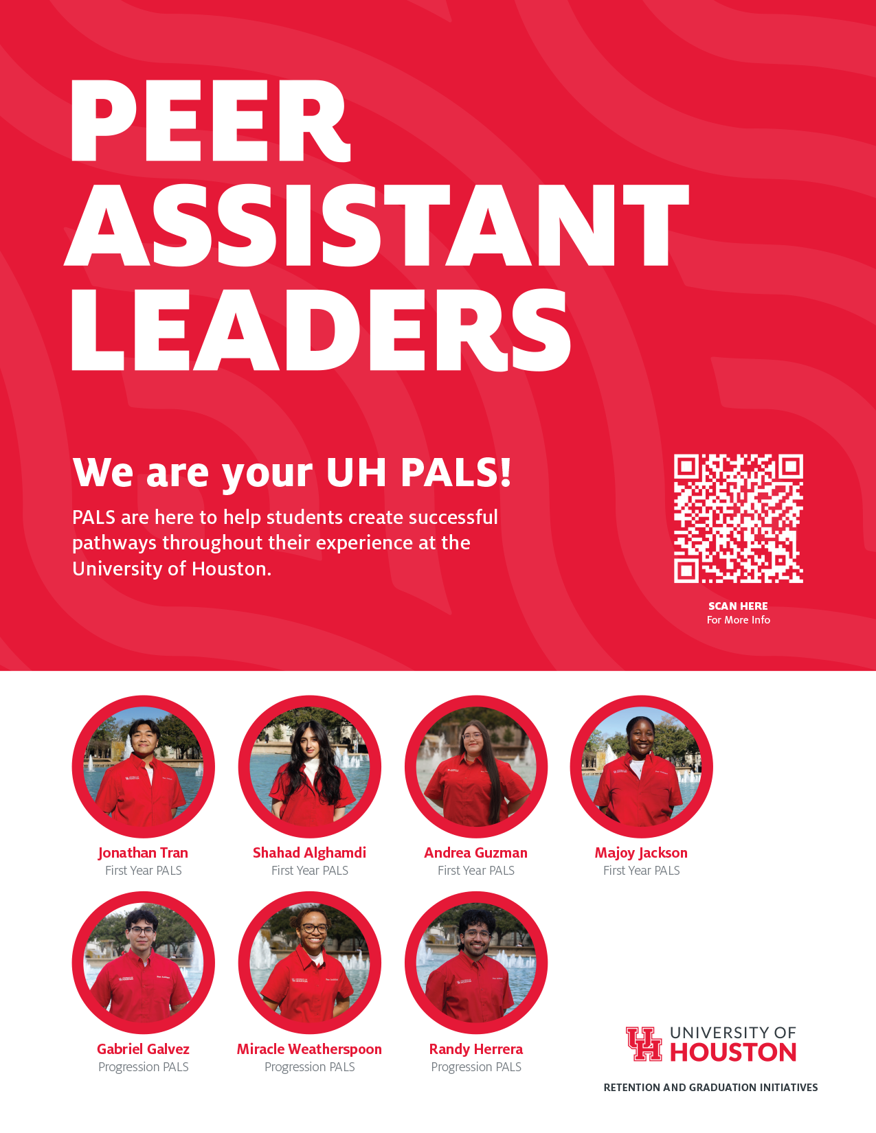
Icons
Our single-colored icons reveal direct yet high-spirited elements that support our story and build on creativity.
The idea behind the icons is to keep them simplistic and direct to make bold visual statements that support the copy. Designed as flat, single-color symbols, icons should not be used for decorative purposes and should be used as support elements in larger illustrations or secondary visuals.


Please Note: Icons are not logos and should not be used to identify a department, college, program or University business unit.
Photography
Houston’s brand of photography strives for an in-the-moment feeling. We use images captured from unexpected angles or vantage points to create a candid feel. Photos including university officers or leadership must be submitted to branding@central.uh.edu for review and approval prior to publication or posting.
Portraits
Portraits, especially, should show the confidence and focus on the subject without feeling staged. The lighting should give the photographs an overall warmth and help them drive the aspirational tone.
Action/Group Shots
Using more candid shots is what makes the brand’s photography feel approachable. It has a tonal warmth while still showing a confidence in the subjects. The lighting and lens flares demonstrate the brand’s aspirational ideals.
Campus/Object Shots
Unexpected angles are employed in the campus shots as well. This type of photography should be more staged and laid out with intention unlike the photographs with human subjects.
Duotone and Monotone Photo Techniques
This photo technique is an option that uses the colors from the brand palette in combination with black and white photos to create colorful graphic images. Please note: the images that are used with this technique still need to remain in the brand style.
Photography Don’ts
It’s helpful to see the great shots, but it’s also important to know what to avoid when capturing photography. Here are some photography don’ts.
-
Dated Technology
-
Inauthentic
-
Forced diversity/Too staged
-
Too staged/Photo aware ruins candidness
Video
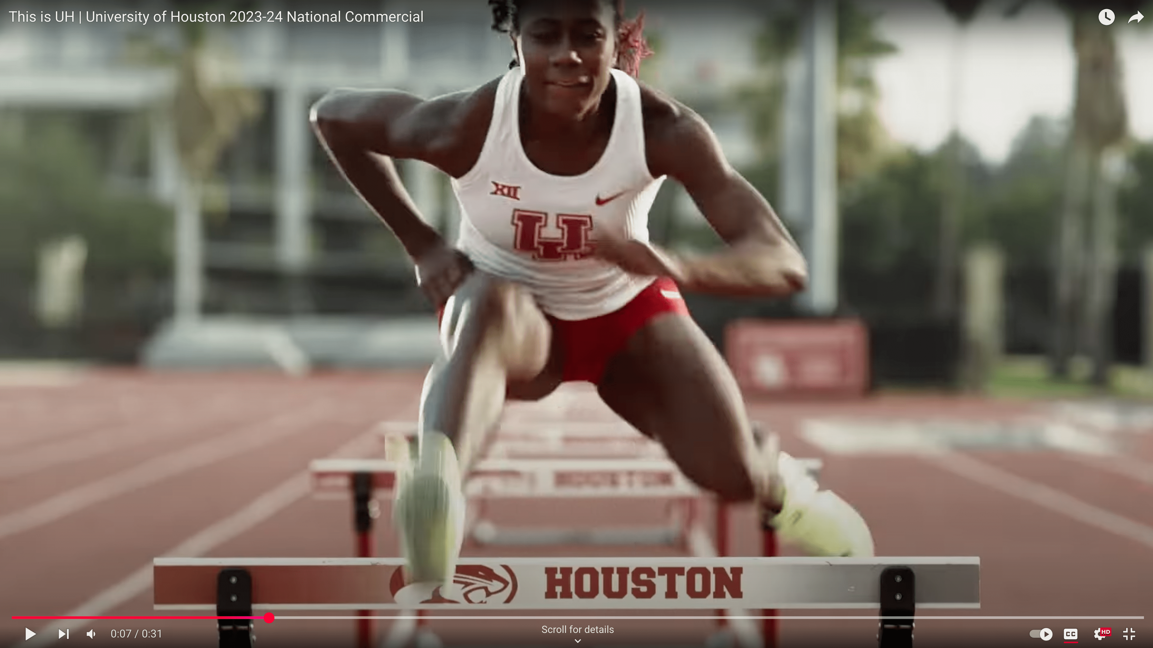
Videos should follow the same general guidelines outlined for photography. Striving for candid shots, capturing insightful moments and finding unexpected angles help create videos that have a sense of warmth to help UH tell its stories genuinely and honestly.
Copy and Editorial
First impressions make a difference. Printed and online publications, distributed to internal and external audiences, are a vital part of our image. While we are a mix of colleges and institutes, centers and programs, we are one University — the University of Houston — and it is important to show consistency in the way we present ourselves.
For guidance a detailed information on the University of Houston’s editorial style, please refer to the Editorial Styleguide.
